- Joined
- Feb 8, 2008
- Messages
- 728
- Points
- 16
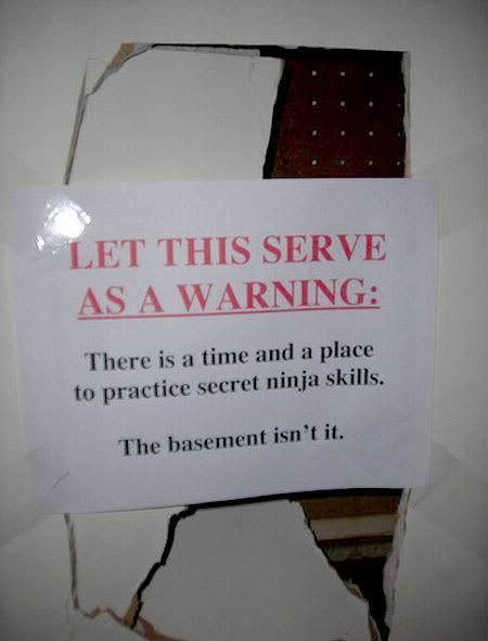
most of these are wayyy to complicated for a laser etching; and pierce, by the time you made your logo small enough to etch, you wouldn't be able to read the company name.


Follow along with the video below to see how to install our site as a web app on your home screen.
Note: This feature may not be available in some browsers.


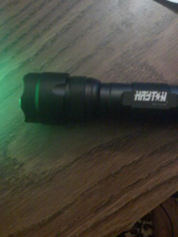
That is awesome! Great logo!bobobob121 said:i got soo carried away with my logo that i couldn't help myself so i put it on my laser.
and without further ado....i give you the FIRST kryton laser EVER!! ;D
bobobob121 said:most of these are wayyy to complicated for a laser etching; and pierce, by the time you made your logo small enough to etch, you wouldn't be able to read the company name.


VillageIdiot said:I like RA_pierce's a lot (the first one).
Since I only want to have a few submissions, which of mine do you guys like the most? Some guy liked this

I did this by modifying a boring-looking font, adding a few sharp bits here and there and making it look more 'angular'. I wanted to do that bottom spike on the 'Y' but I couldn't make it look right >.<
I can show you what it would look like in flat black or white if you want, Kenom. I can add a snowflake on the end if you want as well, I guess.
VillageIdiot said:He's called Kryten, isn't he?
Also, my entry doesn't look very good with the snowflake, I'm going to change it.
el-taco said:[quote author=VillageIdiot link=1216695019/100#119 date=1216882867]He's called Kryten, isn't he?
Also, my entry doesn't look very good with the snowflake, I'm going to change it.
")