Welcome to Laser Pointer Forums - discuss green laser pointers, blue laser pointers, and all types of lasers
How to Register on LPF | LPF Donations
Navigation
Install the app
How to install the app on iOS
Follow along with the video below to see how to install our site as a web app on your home screen.
Note: This feature may not be available in some browsers.
More options

You are using an out of date browser. It may not display this or other websites correctly.
You should upgrade or use an alternative browser.
You should upgrade or use an alternative browser.
Kryton Logo competition
- Thread starter Kenom
- Start date


Kenom
0
- Joined
- May 4, 2007
- Messages
- 5,628
- Points
- 63
I like both. Very good job all around. At this rate this thread is going to be 50 pages in 2 weeks. LOL
- Joined
- Mar 14, 2008
- Messages
- 1,402
- Points
- 0
I like RA_pierce's a lot (the first one).
Since I only want to have a few submissions, which of mine do you guys like the most? Some guy liked this

I did this by modifying a boring-looking font, adding a few sharp bits here and there and making it look more 'angular'. I wanted to do that bottom spike on the 'Y' but I couldn't make it look right >.<
I can show you what it would look like in flat black or white if you want, Kenom. I can add a snowflake on the end if you want as well, I guess.
Since I only want to have a few submissions, which of mine do you guys like the most? Some guy liked this

I did this by modifying a boring-looking font, adding a few sharp bits here and there and making it look more 'angular'. I wanted to do that bottom spike on the 'Y' but I couldn't make it look right >.<
I can show you what it would look like in flat black or white if you want, Kenom. I can add a snowflake on the end if you want as well, I guess.
GooeyGus
0
- Joined
- Mar 8, 2008
- Messages
- 2,669
- Points
- 48
All these submissions sure are nice... but I dont want you guys to keep spending so much time on them when mine is so clearly going to be the winner...


- Joined
- Mar 14, 2008
- Messages
- 1,402
- Points
- 0
I like it, but maybe less italics? Can you do that without starting again? =P
- Joined
- Mar 14, 2008
- Messages
- 1,402
- Points
- 0
Nice!
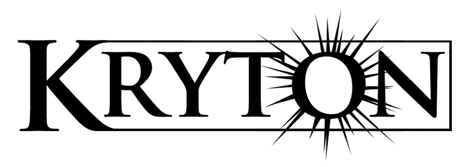
Oh no, here comes more constructive criticism. Perhaps enlarge the snowflake so the two left spikes don't overlap with the cool line running through the text. This will make it look cleaner, but might unbalance it a bit. Give it a try?
Oh no, here comes more constructive criticism. Perhaps enlarge the snowflake so the two left spikes don't overlap with the cool line running through the text. This will make it look cleaner, but might unbalance it a bit. Give it a try?
RA_pierce said:Here's a couple in PNG format... They're just solid black.
The first one is the same as the one I posted earlier.
What do you think?

I vote this one.
VillageIdiot said:Nice!
Oh no, here comes more constructive criticism. Perhaps enlarge the snowflake so the two left spikes don't overlap with the cool line running through the text. This will make it look cleaner, but might unbalance it a bit. Give it a try?
Heres a large one and a different one. I used the same style as I did with the writing, having nothing somewhere to make it appears its there.
The larger one looks imbalanced IMO.
If I wanted to I could remake it with a thinner line.
Attachments
- Joined
- Mar 14, 2008
- Messages
- 1,402
- Points
- 0


