Welcome to Laser Pointer Forums - discuss green laser pointers, blue laser pointers, and all types of lasers

Buy Site Supporter Role (remove some ads) | LPF Donations

Links below open in new window

FrozenGate by Avery

Daguin custom 445

I run mine at 650mA, and around 10:00 here, while its dark but some light, the beam is VERY solid...Far more than my 200mw green, I do have a G1 glass lens on my laser, but when its pitch black outside the thing is amazing...


I run mine at 650mA, and around 10:00 here, while its dark but some light, the beam is VERY solid...Far more than my 200mw green

Yeah, that's the way I see it. The blue doesn't look diffuse to me at all. The lower power green is thinner, and less intense looking to me. If you turned them both sideways to the viewer, the blue would be easier to pick up on with your vision. Also, when the room is lit, the green beam becomes hard to see, while the blue remains plainly visible. I think that's the best test to do.
 
Yeah, that's the way I see it. The blue doesn't look diffuse to me at all. The lower power green is thinner, and less intense looking to me. If you turned them both sideways to the viewer, the blue would be easier to pick up on with your vision. Also, when the room is lit, the green beam becomes hard to see, while the blue remains plainly visible. I think that's the best test to do.

True. My site isnt working, but I had pics with my green/blue laser on, and the blue was super over powering my green laser, solid blue room.

As you said, the green is thinner, and my green does beam farther due to that, since the blue has a fat spreading beam, it breaks up faster.
 
I don't know if it's my eyes being more sensitive to blue or what, but I set my 445nm laser down to 750mW, and it is WAY brighter than a 145mW green beam sitting right next to it. Actually, 5 people agree with me seeing it in person. The 445nm beam appears 3 times brighter than the 145mW of green.

How were you comparing the two? My test was spot on white wall. This is biased in favour of the blue since the paint probably fluoresces slightly. But the green is definitely brighter. I repeated the test with my glasses off, so that the spot size becomes irrelevant. Green still brighter.

Your ratio is 5.2. Mine is 3.9. This may explain some of the difference. But conventionally, the equivalence ratio between 445 and 532 is supposed to be more like 30 (which would equate your 750mw of 445 to about 25mw of 532). So your result is quite surprising!
 
....From a "beam profile" point of view, my preferences is still DPSS - LoPo 650 - HiPo 650 - 405 - 445... . So if your 473 DPSS lasers are as clean as a good quality 532 module, than I would say it's worth the extra cash, regardless of how pure or what-have-you the blue is.

Oddly enough, now that I have this 445nm build in my hands, I'm not sure how to categorize it (i.e. 5xx & 473 for beam "viewing", 660, 405 for burning...). Maybe it will turn out to be the jack of all trades, burning and looking good while it's at it... :p

My greens definitely give the tightest spots. My viper and blue sky both give round dots of less than 1mm at the aperture. 405 is a bit more eliptical and red is nice and round but more like 2 to 3mm. I would say for the "wow" factor, green will always win. For burning, there's nothing to touch 405. For the pencil thin laser beam effect, red wins (not too bright, not too faint and doesn't attract too much attention from the neighbours). The real attraction of the 445 is just seeing a bright blue that only 3 months ago would have cost thousands of dollars!
 
Lens/beam spot
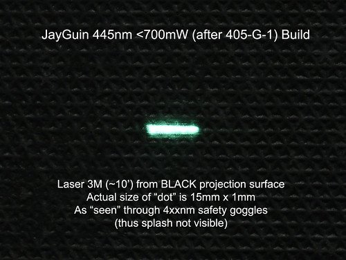
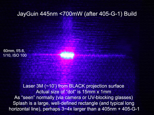
The lens produces a very clean bar-shaped profile with no ghosting or artifacts. You can actually see the diode sections.
Agree (on the clean bar shape) and disagree (on the artifacts). Well actually, that depends on how one defines "artifact". All "diodes" seem to produce 1. a dot (or bar) 2. a long line 3. a rectangle on one side of the "dot" & long line....


How were you comparing the two? My test was spot on white wall. This is biased in favour of the blue since the paint probably fluoresces slightly. But the green is definitely brighter. I repeated the test with my glasses off, so that the spot size becomes irrelevant. Green still brighter.

Your ratio is 5.2. Mine is 3.9. This may explain some of the difference. But conventionally, the equivalence ratio between 445 and 532 is supposed to be more like 30 (which would equate your 750mw of 445 to about 25mw of 532). So your result is quite surprising!

I don't buy that "equivalence ratio" garbage. Not when they are supposed to be telling me what my eyes see. After all, I have eyes for that.

I never use what the dot looks like. I can't look at the dot without goggles, and with goggles on, that is not a comparison for what the eyes see. I simply use the beam shined off into the sky.

OK, I put 300mW of green next to 750mW of blue. The blue is still brighter to me. The beam is much more visible outdoors when there was still sunlight visible. I again had a witness, and I first asked before saying anything, "Which beam looks brighter to you?". The answer they gave me was, "The blue one".

I agree that it seems wrong, because all of those graphs have you think that the green is 10 times brighter to the eye. That's why I'm forgetting about those graphs from now on.

My eyes have seen the light. :D
 
My eyes have seen the light.
Mine have too and it was green, but it's a moot point. 445nm is still low enough of a wavelength to look different to different people.

I'll be taking a few "side-by-side" shots this weekend; however, even a camera doesn't know exactly what blue is. For example, there's a few camera sensors that don't follow the RGB rule, but use "GRGB" (or RGGB) because the designers assume that green is more important to us (optically-speaking), so they add an extra green pixel (or more accurately, pixel filter). None the less, it will be interesting to see the difference, even if it can't determine which one is perceived as truly brighter to the human eye... .
 
OK. Let's take this stuff to the "Spyder II" thread in the 445nm board

Peace,
dave
 
I tried asking nicely . . . . . . :angel:

Peace,
dave
 
Last edited:
deleting post is not cool daguin. you have changed.

I know, but this WL Arctic mania is infiltrating the entire forum. I will be so happy when they ship and people get to release their angst over it. :undecided:

Peace,
dave
 
I know, but this WL Arctic mania is infiltrating the entire forum. I will be so happy when they ship and people get to release their angst over it. :undecided:

Peace,
dave
If that ever happens.:crackup: Good thing i went with diy :P
 
...even a camera doesn't know exactly what blue is ... None the less, it will be interesting to see the difference, even if it can't determine which one is perceived as truly brighter to the human eye... .

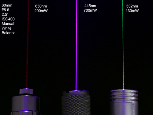
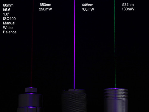
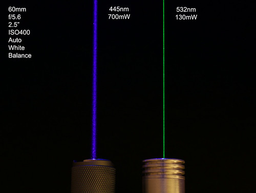
Well, well, according to my camera, blue (445) wins! But also according to my camera, on which I manually set the white balance, blue = BluRay "purple"... :huh:

But between you and me, it really "looks" blue, regardless. One of the images below was taken using "auto" white balance and in that image, the blue imitates real life more closely. Finally, a separate shot with a real BluRay which is much less brighter than the 650, never mind the 445 & 532 "bad boys".


Traveller,

Thanks for the photos.

To best describe the way my eyes see the two (~750mW blue vs ~140mW green), take the patchy green beam from your second photo from the top, and put it next to the wide blue beam in your third photo.

I do realize that a trick is being played on the eyes. If one were to take a sliver of that same blue beam as wide as the green, the green would surely win in the area it covers. The large area that the blue beam covers basically catches my attention more, if you will. To me I call that brighter, but admittedly it may not be the likely definition, which would usually mean brightness over area. My usage of the term is represented differently by my visual model.

It is indeed a touchy subject to compare, because no two people can be sure their visual model of brightness matches one another.


Back
Top