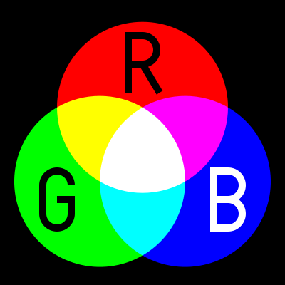
hmm.....I wonder if there is a formula that takes into account the average sensitivity of the different cones so that you can just plug in the wavelengths/power you want to mix and it will spit out the resulting wavelength....
Haha, yes, there is...but it's a bit more complicated than just "a formula". There is an entire mathematical framework built upon the theory and science of color perception in the human eye, and the approaches used today have been developed literally over the last 80+ years (the first big publication was the basis for the commonly-used CIE chart, the one you see if you google image search for "CIE chart", published in 1931***). The result is a set of color matching functions (there are actually different sets of functions now, some more commonly used than others). The 1931 stuff is still the easiest to "see" without doing more work, but the later stuff makes more sense once you get into it and is more accurate/representative.
For the quickest way to get at it yourself without having to take days to learn all of it, just go download a program called Chroma. It was made by a PhotonLexicon forum member named Tocket, here's his post about it on PL:
Chroma - a laser color blender. Chroma does what you want: you put in monochromatic light sources with set powers, and it shows you where that mix of colors would fall on the 1931 CIE chart. Keep in mind the CIE chart is still very approximate though, because computer monitors are incapable of reproducing all the colors on the chart. Any given monitor can only reproduce colors within a small triangle on the CIE chart, not the whole thing, so what you see on the chart is just a representation/approximation of the colors, but it gives you the idea.
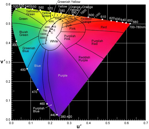
***Actually, if you just google image search for "cie chart", you'll see the more common 1931 CIE chart, and the newer/better/but more complicated 1975/1976 CIE chart. The 1931 is "taller" and has axes of x and y, while the later one is more short and wide, with axes of u' and v'. Here's a good version of the 1976 chart:
Basically, around the edges you see monochromatic wavelengths. Combining 2 wavelengths, by varying the power ratio you can reproduce any color on the straight line between those 2 wavelength. This is why white LEDs can be made with simply a blue LED and a yellow phosphor, it comes out white (although there are other problems, like color reproduction, as in shining white light made by blue+yellow will look white on a white surface, but won't look right if you shine it on a red surface, since there's no red light to reflect off of it, screwing with the reflected color you see).
Combining 3 wavelengths, you can reproduce any color enclosed by the triangle that connects the 3 wavelengths. This is why RGB is good: it makes the biggest triangle, and reproduces the most colors, ie has the highest gamut. LCDs and such are not monochromatic light sources, hence why they can't go all the way to the edges, and the gamut is quite limited. Which is one reason that laser displays are a great idea: monochromatic light sources mean you get a wider color gamut!


