
Welcome to Laser Pointer Forums - discuss green laser pointers, blue laser pointers, and all types of lasers
How to Register on LPF | LPF Donations

Navigation
Install the app
How to install the app on iOS
Follow along with the video below to see how to install our site as a web app on your home screen.
Note: This feature may not be available in some browsers.
More options
You are using an out of date browser. It may not display this or other websites correctly.
You should upgrade or use an alternative browser.
You should upgrade or use an alternative browser.
Kryton Logo competition
- Thread starter Kenom
- Start date
")


- Joined
- Mar 14, 2008
- Messages
- 1,402
- Points
- 0
True... but that's fixed with a flick of the magic wand tool. =P Do you reckon it'd be better if I deleted the white and made it transparent or coloured it black? o.o
- Joined
- Mar 14, 2008
- Messages
- 1,402
- Points
- 0
Murudai has some very good points about format, I myself have modified my entry to fit in with competition guidelines and make the playing field more level. No harm meant to Villageidiot but having designs change half way through the poll was one of the reasons it was reset in the first place. I propose that before this gets out of hand, we decide on a usable standard size and format and reset it again. 1 final entry per person, no changes once started. Maybe even lock the thread untill completion of the poll.
/DevilsAdvocate
To GooeyGus, I'm pleased that you like my rendering work, but I think its important that people make their decisions based on the design of the logo and not anything else. I actually feel kind of guilty for constantly shilling my logo on the renderings to be honest.
I know some of you are disappointed that the groove part of my design has been dropped from my entry. The concern as Kenom explained is that it would be Irrelevant for future runs. What I would like to say now is that I would be more than happy to design fitting logos for any future barrel designs and would even share font, size, and other relevant information so that others could make matching designs as well.
Basically I like my design as a whole, and want to make clear that it does not have to be incompatible with future runs or competitions if you don't want it to be.
As often happens I have probably Jumbled my words or distorted my intended meaning in some way so if you want me to clarify something I have said here please let me know.
EDIT: As an afterthought, If we are to make standard Images, Kenom suggested last night that I do a render of each entry. That might be a good way to keep everything fair. Let me know what you think. This is the mask I used for my renders:http://i51.photobucket.com/albums/f351/cogboy/Krytonlogoexample.png. If you want me to do a render for you pm me an image in the same layout and format.
It would only take me one evening to do one for everyone.
pwnstar
0
- Joined
- Sep 12, 2007
- Messages
- 712
- Points
- 0
wow, I cant believe I missed this whole thread till now.
Kenom
0
- Joined
- May 4, 2007
- Messages
- 5,628
- Points
- 63
lol pwnstar.
I know that scog has made a good point. I'm not horribly excited about redoing the poll again but if it's fair that way, then that's what we should do. It wouldn't be very hard to do. Entry #1 and 6 should be put in total black and white.
What does everyone else think?
I know that scog has made a good point. I'm not horribly excited about redoing the poll again but if it's fair that way, then that's what we should do. It wouldn't be very hard to do. Entry #1 and 6 should be put in total black and white.
What does everyone else think?
artix
0
- Joined
- May 24, 2008
- Messages
- 994
- Points
- 0
Kenom said:lol pwnstar.
I know that scog has made a good point. I'm not horribly excited about redoing the poll again but if it's fair that way, then that's what we should do. It wouldn't be very hard to do. Entry #1 and 6 should be put in total black and white.
What does everyone else think?
I think that Scog still has the best logo!
Zom-B
0
- Joined
- Mar 25, 2008
- Messages
- 895
- Points
- 28
Yes VillageIdiot's logo can be in B&W.
Depending on the resolution, gamma, and bleed of the etching laser, it might look good when etched from this:

VillageIdiot might want to change the highlighting, because as it is now, the light edges are on the right and bottom
Depending on the resolution, gamma, and bleed of the etching laser, it might look good when etched from this:
VillageIdiot might want to change the highlighting, because as it is now, the light edges are on the right and bottom
- Joined
- Mar 14, 2008
- Messages
- 1,402
- Points
- 0
Unfortunately I have a good example of the resolution limits here and that would not come out right unless it was done in the same size as it appears on screen. I wish i could take a good photo but here is a shot from my cellphone
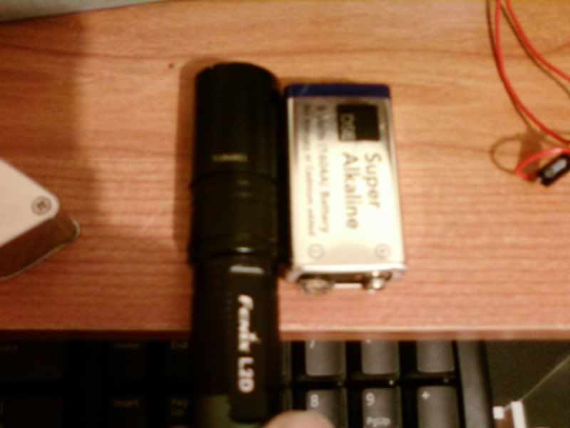
See the blurry white line at the head of the flashlight? that is the serial number that goes like this: US844851. It's about as small as it can get while still remaining clear. the 2 4's in the number both look very different up close, as do the 8's. I have no Idea what this translates to in dpi but I think it will be best to stick to solid colours for this. The etching gives a slightly textured surface anyway, so it would not turn out too far from what you are going for, but the edges would be sharp.
See the blurry white line at the head of the flashlight? that is the serial number that goes like this: US844851. It's about as small as it can get while still remaining clear. the 2 4's in the number both look very different up close, as do the 8's. I have no Idea what this translates to in dpi but I think it will be best to stick to solid colours for this. The etching gives a slightly textured surface anyway, so it would not turn out too far from what you are going for, but the edges would be sharp.
Kenom
0
- Joined
- May 4, 2007
- Messages
- 5,628
- Points
- 63
indeed.
- Joined
- Mar 14, 2008
- Messages
- 1,402
- Points
- 0
You gotta say though dude, Zom-B's remix of my idea looks bad-asssssss.

GooeyGus
0
- Joined
- Mar 8, 2008
- Messages
- 2,669
- Points
- 48
To GooeyGus, I'm pleased that you like my rendering work, but I think its important that people make their decisions based on the design of the logo and not anything else. I actually feel kind of guilty for constantly shilling my logo on the renderings to be honest.
Oh I know! trust me, if I didn't think yours was the best for the barrel, I wouldn't be voting for it ;D
I think the other entries are REALLY awesome looking and everything, and in theory they are great, but in practice I think yours (scog) will work the best on the barrel.
Zom-B
0
- Joined
- Mar 25, 2008
- Messages
- 895
- Points
- 28
I used Paint Shop pro. First I loaded the transparency into the image from the alpha channel, then I removed transparency again by down sampling it on a white background. These steps are effectively the same as showing the PNG in internet explorer and taking a screen shot. Then I reduced the colors to 2, and selected the Error Diffusion/Burkes method. This unfortunately created some alien pixels in the white area, as if it was not totally white (maybe the Burkes algorithm erroneously expects 256 to be white) so I restored the white by selecting all white area in the image before reducing colors and pasted it in the same place, after. Then remains the inverting, so pixels being etched (which look lighter on the barrel) are white.VillageIdiot said:^I like that. A lot. Here's that inverted:
What filter did you use to achieve that Zom-B? I only have Paint.NET.