Welcome to Laser Pointer Forums - discuss green laser pointers, blue laser pointers, and all types of lasers

LPF Donation via Stripe | LPF Donation - Other Methods

Links below open in new window

ArcticMyst Security by Avery

Kryton Logo competition


Scog

0
Joined
Aug 28, 2007
Messages
87
Points
0
Ok, here are some designs I've been working on. There are some variations, and I would love to hear what people prefer.


These first three I like the symbolism of the photon, but I also worry that its too cluttered, especially the top one where it obscures the text somewhat.

groovevariations02.png


These ones are the same as the first, but without the photon symbol. Simple but effective.

groovevariations01.png


Here is an example with some different colours, just for fun.

colours.png


Let me know what you think, so I can narrow down the selection a bit :)
 
Joined
May 2, 2008
Messages
475
Points
0
Good stuff Scog. I like the ones in the second picture the best, the middle logo of the second picture to be exact.
 

Kenom

0
Joined
May 4, 2007
Messages
5,629
Points
63
I like it raised like that too. Makes it so you can reduce the size of the word groove and put it below slightly to the right
 
Joined
Nov 20, 2007
Messages
218
Points
18
*I also agree with maven, you need to "align" the letters with one another a bit better
-Check: Aligned all letters with construction lines.

* The r needs to be a bit taller.  
-Check: Raised the r up.

*Y needs to be moved down just a teenie bit,
 -Check

*T needs to be enlarged.  
-Check: Made the T a bit wider and darkened the top of it a little to give it more definition.

*n needs to be straightened out a bit.
-Check: Rotated the legs of the N so that they match eachother and the other letters.

The first pic just shows the construction lines making all the small case letters the same height.

kryton-original-constructio.jpg


Grayscaled:
kryton-grayscale3.jpg


And full color (I dunno why I include this every time):
kryton-original3.jpg
 

Scog

0
Joined
Aug 28, 2007
Messages
87
Points
0
Your logo is my favourite out of my competition, so I whipped this up before breakfast. Literally. :)

Itsgoodbutdontvoteforitlol.png


I still like mine better though. :p
 
Joined
Nov 20, 2007
Messages
218
Points
18
Scog said:
Your logo is my favourite out of my competition, so I whipped this up before breakfast. Literally. :)

Very cool! I love the 3D models. What software are you using to do those?

I do alot of drafting with Autocad here at work and occasionally a few 3D models. The ones you did look very realistic.

As for the logos, I like the one you posted in the middle of the middle pic alot (the one with the capital K flush with the top of the lower case letters). Definitely one of my favs.
 
Joined
Nov 20, 2007
Messages
218
Points
18
One more version with icecycles at the top.
 

Attachments

  • kryton-cycles2_001.jpg
    kryton-cycles2_001.jpg
    23.3 KB · Views: 72

Scog

0
Joined
Aug 28, 2007
Messages
87
Points
0
MERC said:
If you want to see what laser engraving annodising can do take a look at this  www.oddpb.com
Wow, there is some really cool stuff in those galleries.


RattleHead said:
Very cool! I love the 3D models. What software are you using to do those?

I do alot of drafting with Autocad here at work and occasionally a few 3D models. The ones you did look very realistic.
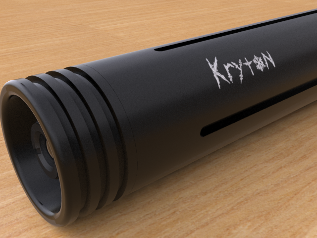
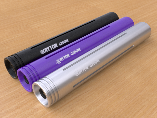
The Barrel is modelled with Rhino, then imported into 3ds max and rendered with vray. These latest images are lighted with an hdri map, giving realistic results and fast render times. The materials are a mixture of ones downloaded from the net and custom made ones.

I started about a month ago with no prior experience so if others are interested in doing similar stuff, don't think you can't! It might look intimidating but this is one of the most enjoyable and rewarding projects I have ever attempted. Most projects that I start don't get finished and this is a fabulous exception. :)
 
Joined
Nov 20, 2007
Messages
218
Points
18
Scog said:
I started about a month ago with no prior experience so if others are interested in doing similar stuff, don't think you can't! It might look intimidating but this is one of the most enjoyable and rewarding projects I have ever attempted. Most projects that I start don't get finished and this is a fabulous exception. :)

Very impressive! I started working with 3D models in Cad about 5 years ago and mine still don't look as nice as yours.
 

Kenom

0
Joined
May 4, 2007
Messages
5,629
Points
63
Yes that icecycle one is shaping up to be absolutely marvelous. I would have to say that this is EXACTLY what I was looking for. I'm not going to say that it's what's going to go on the side of the barrels as I'm not the only opinion that is going to count in this.
 

Kenom

0
Joined
May 4, 2007
Messages
5,629
Points
63
not seein anything there icey. You won't be able to post links till you've got 10 or 20 posts. If you break it up someone will put it back together and post it.


Top