3zuli
0
- Joined
- May 30, 2009
- Messages
- 810
- Points
- 28
it's a magic and it's name is Photoshop  (for me)

Follow along with the video below to see how to install our site as a web app on your home screen.
Note: This feature may not be available in some browsers.


Kryton Beast,
Kryton Smooth,
Kryton PPR,
Kryton Groove,
Kryton Block.

Uhm ..... the models names MUST remain these ones, or can be posted different suggestions ?


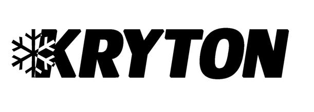
The Kryton portion of the logo is the same so it's all good. Adding on top like that is perfectly acceptable. I had thought that the beast was going to be smaller than the word Kryton, but now that I've seen it bigger, it adds that certain intimidating factor that I think the beast needs. Might even consider the eyes inside the claw marks. One thing I would like to note. There is NO WAY for me to distinguish the two tone entry when it's engraved onto the host. I should have stated it will be ONE TONE. positive no negative. I think the best way to envision this is your paper is black.. and you only have a white pencil.
Needless to say, the entries thus far are promising. I'm not going to make statements to the positive or negative on any entry as I don't want to offend anyone because my tastes differ from yours. Each persons talent and creativity is a reflection of each individual person and as such, is beyond reproof.


