Re: New Banner for Stonetek !
Exactly
")
Oh, I didn't mean to say you couldn't change it, I was referring to the fact that none of use have included what the shop is about simply because we had no information about it, and StoneTek doesn't sell exclusive components (like the CNI example I gave).
Regarding the "Apple" branding subject: It's an exception. I mean, you walk down the street and see the well known bitten apple... you know there's gonna be a Mac/iPod product somewhere on it. Professional photographers nowadays include Apple's isotype as a symbol of elegance, sleek
ness, coolness, etc. Subsequently Apple doesn't even need to pay for publicity! It's a purely 100% great innovation. See, publicity is the most expensive thing when it comes to huge companies like Coca-Cola, Apple, M$... The fact that they don't need to advertise their products everywhere because their clients reproduce the isotype wherever they can, and other advertisers use the same isotype in their advertisements is just genius.
Finally, regarding the more involved description: That's just me, it's the way I present my designs. I like to explain how and why the design turned out to be that way.
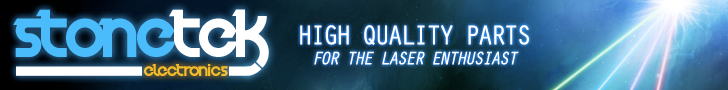
EDIT: The font for "StoneTek" is easily changeable. I couldn't go with a spacey-techy font since it'd affect the final concept.
Hmm...perhaps not spacey-techy, but I think it just looks a bit too plain in relation to the rest of the banner (I didn't take a close look at it, but the font looked like Arial/Verdana/Helvetica, which is great for body text but not usually great for logo design unless stylized or changed in some manner.) Perhaps try using Impact or another slightly more stylized font? I would advise against using a tiled yellow/black on the site itself, though - that would hurt most people's eyes and I think that might be a bit TOO vibrant. Perhaps do some variation of the radiation thing that's a bit more subdued for the site header itself?
Yeah - won't argue that Apple is genius at getting free word-of-mouth advertising. I think the gaming company Blizzard is pretty good at that too. Anyways, my point on that subject was that I would actually argue that conveying WHAT your product is is not necessarily the most important part of publicity and of marketing in general. It's the conveyance of trust, of the feeling that this is the right product/brand for you, that this brand makes quality products that's important. Case in point: Wicked Lasers does really well primarily because of great branding and good looking banners, along with some good design on their products. Yet, for a long time, at least according to the posts I've read here, they manufactured underspec, overpriced lasers. Why did people keep buying into it? Because Wicked did a great job of branding and showing off their lasers through various marketing tools designed to convey the power of their products (case in point, the video of the Wicked Torch making scrambled eggs almost made me want to buy one, despite the fact that I have no need for a 4100 lumen flashlight that only lasts 15 minutes per charge).
Anyways, here's a revision of my banner with some more relevant (and hopefully slicker) text in place of what I had before:
A quick rundown on my thought process for this:
When I designed this banner, I was thinking that it was primarily for placement on this forum, and in fact would be happy to design a completely different one for the purposes of a header on the site itself. Essentially, I wanted something that would match the color scheme of the site itself well, and decided to go with a black/blue/greyish background as a result.
First, I painted in the background lights and added a few gradients to give the background some depth. I did some cloud brushing, smudging, and then some sharpening in order to convey the effect of a smokey or foggy substance, which laser users frequently use to "up" the dramatic impact of their photos and videos. I had to rework my original design so that only the beams themselves were showing, so I rebrushed and angled them, and added that burst of light to show the source of the lasers themselves - a dramatic unknown entity. I was hoping to make the banner itself fairly intense, to try and catch the eye of people browsing, so I brushed in some more lights and touched up the source of the lasers with some smudging.
The logo itself is designed to bring to mind the boldness of color and type of various Web 2.0 designs, yet also convey the power and cutting-edge nature of the technology itself - something that successful companies with much higher marketing budgets in this area seem to do. I wanted the logo to be something that could be used in a self-contained way in different color schemes, whether it be printed in grayscale on an invoice or sheet of paper, or in a different color over white, and still be legible. The curve under the type serves to emphasize the logo and invoke the feeling of a "beam." A subtle glow also draws attention the name and helps to make the logo feel more in-line with the rest of the composition. What I really wanted to make sure with the logo, however, is that it would stand out: that looking at that font and that logo would make it instantly associate itself in the mind of the viewer with StoneTek. That's the big problem I think with using some variation of a simple sans serif such as Verdana or Arial: there's little or no association with the shape and feel of the logo itself with the company, especially if you just type it without arranging it in some fashion. If you just type the name out, the name itself means nothing, it's the same as reading the word on a document. You instead want something recognizable that your customers can associate a positive experience or positive brand equity with.
Finally, the type in the middle was meant to be something simple, yet original. It was actually probably more difficult to choose than the main font, as I tried about 8 or 9 different ones before I found something that worked. It's again meant to convey a sense of the cutting edge and high-tech, but not to an alarming or distracting degree. The phrase itself, "High quality parts for the laser enthusiast" is meant to convey not only that the products that the store sells are consistent and of high quality, but also that it's the RIGHT store for do-it-yourselfers and people who want to take themselves to the next step beyond buying a laser pointer in a box. Hopefully, it also accurately portrays what the store itself wants to sell itself as.
Anyways, sorry for yet a third wall of text, and if anyone managed to read through all of that, :thanks:! and big props to you
. LPF was actually having trouble posting this post because it was so long lol.


") . All it really requires is about 8 seconds in Photoshop.
. All it really requires is about 8 seconds in Photoshop.