Welcome to Laser Pointer Forums - discuss green laser pointers, blue laser pointers, and all types of lasers

LPF Donation via Stripe | LPF Donation - Other Methods

Links below open in new window

ArcticMyst Security by Avery

Got Bored - New LPF logo

CurtisOliver

0
LPF Site Supporter
Joined
Jun 12, 2015
Messages
7,609
Points
113
Hi everyone,
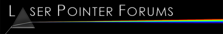
As the title suggests I got a little bored, so in my spare time I for some reason decided to make an updated version of the LPF logo.
I was only playing around originally but the result didn't turn out too bad so I thought I'd share it with you.
The major change is that this logo is true to physics and the logo has been rendered in Photoshop.

JPG version with black background:

LPF%20Logo%20728px.jpg


PNG version with no background:

LPF%20Logo%20728px.png


Website view:

LPF%20logo%20desktop%20view.jpg


Well there you are, the png version can be overlayed over any darkish background.
Enjoy and let me know what you think.
Curtis

EDIT - Improved the spectrum slightly.
 
Last edited:


CurtisOliver

0
LPF Site Supporter
Joined
Jun 12, 2015
Messages
7,609
Points
113
Thanks Trinh hong phuoc. :)
Rich, I am working on getting the violet and red part of the spectrum readded. Hopefully it will pan out well.

Edit: Added more red and violet. Should look better now, I hope. :p
 
Last edited:

Ears and Eggs

0
Staff member
LPF Site Supporter
Joined
Oct 1, 2007
Messages
2,874
Points
113
Awesome logo. Think it's time for a new one myself, we've usually upgraded every few years. Not a huge fan of the current one tbh. This was always my favorite, some here might still remember it:


(Sorry, I don't remember who made this to credit them)
laser.gif
 

CurtisOliver

0
LPF Site Supporter
Joined
Jun 12, 2015
Messages
7,609
Points
113
Thanks Simon, interesting logo. The person obviously spent some time on it and it looks good. The only thing I would say is that it looks like it belongs on a astronomy forum. Thanks for sharing that option.

Thanks Lewie, glad you like it. :)
 
Joined
Dec 15, 2014
Messages
6,782
Points
113
Hi Curtis,
Yes you did include the correct WL's and I did notice the violet being a tad faint but still in all well designed. Great job as always buddy new is always refreshing.

Rich:)
 

CurtisOliver

0
LPF Site Supporter
Joined
Jun 12, 2015
Messages
7,609
Points
113
Hi Curtis,
Yes you did include the correct WL's and I did notice the violet being a tad faint but still in all well designed. Great job as always buddy new is always refreshing.

Rich:)
Thanks again Rich. :)
New is refreshing, but for those who don't like change (including myself) I haven't altered the design too much.
 
Joined
Sep 20, 2013
Messages
17,401
Points
113
It looks pretty good, Curtis. My only change would be to separate the colors a bit more coming out of the prism. I understand it is true to life, but that doesn't always look the best.
 

CurtisOliver

0
LPF Site Supporter
Joined
Jun 12, 2015
Messages
7,609
Points
113
It looks pretty good, Curtis. My only change would be to separate the colors a bit more coming out of the prism. I understand it is true to life, but that doesn't always look the best.

I understand what you are saying Paul. Realism doesn't always give the best looking results, but you've put my ocd into overdrive. Must be realistic. :p What I actually aimed for was a more scientifically accurate graphic whilst acting as a underline. Too dispersed won't make a great underline at all and will look odd IMO. Well, this was only a bit of time-wasting for me today so I'm not overly bothered either way. :)
 

CurtisOliver

0
LPF Site Supporter
Joined
Jun 12, 2015
Messages
7,609
Points
113
Lol, anytime you use a prism you will get a reference to Pink Floyd. Thanks Benm. :)
 
Joined
Sep 12, 2007
Messages
9,399
Points
113
I don't suppose anyone else has had a blank bookmark icon for this site since the update?


Top