Welcome to Laser Pointer Forums - discuss green laser pointers, blue laser pointers, and all types of lasers
Buy Site Supporter Role (remove some ads) | LPF Donations
Links below open in new window
ArcticMyst Security by Avery | Browser Hide by Avery

Navigation
Install the app
How to install the app on iOS
Follow along with the video below to see how to install our site as a web app on your home screen.
Note: This feature may not be available in some browsers.
More options

You are using an out of date browser. It may not display this or other websites correctly.
You should upgrade or use an alternative browser.
You should upgrade or use an alternative browser.
Kryton Logo competition
- Thread starter Kenom
- Start date


diachi
0
- Joined
- Feb 22, 2008
- Messages
- 9,700
- Points
- 113
It looks like mutated cactus ;D
")
- Joined
- Feb 8, 2008
- Messages
- 728
- Points
- 16
el-taco said:
you kinda stole my idea.....i had mine a long time ago.
i got soo carried away with my logo that i couldn't help myself so i put it on my laser.
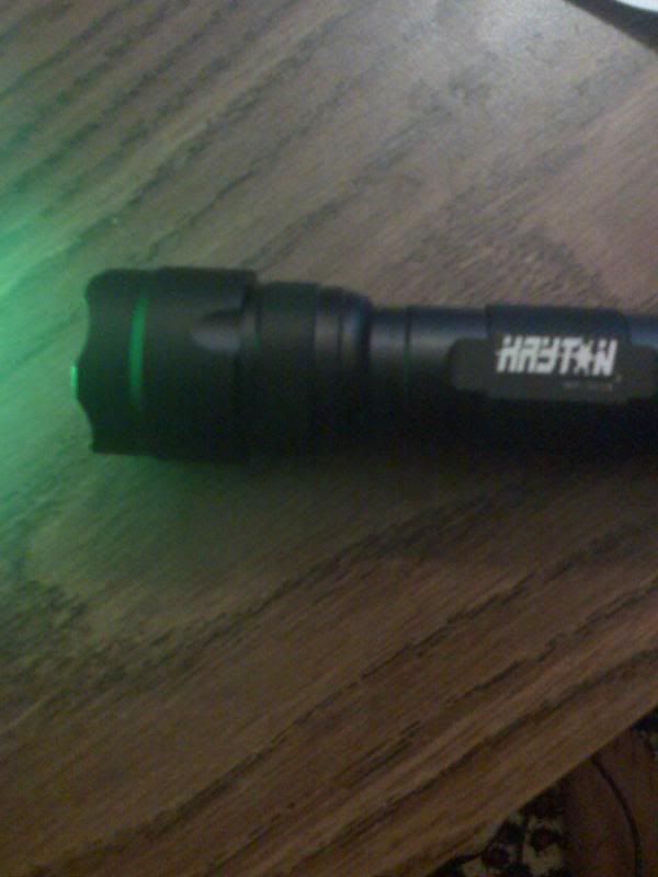
and without further ado....i give you the FIRST kryton laser EVER!! ;D
Kenom
0
- Joined
- May 4, 2007
- Messages
- 5,628
- Points
- 63
LOL Excellent work. Some very wonderful submissions guys. This is going to be a very hard competition. I think in the end we will have everyone select 1 maybe 2 of the best submissions and then I'll go over and select some "finalists" Once everyone agree's on the finalists we can then put them up for a vote.
brtaman
0
- Joined
- Jun 12, 2008
- Messages
- 1,199
- Points
- 48

- Joined
- Nov 20, 2007
- Messages
- 218
- Points
- 18

- Joined
- Nov 20, 2007
- Messages
- 218
- Points
- 18

- Joined
- Dec 24, 2007
- Messages
- 1,000
- Points
- 63
RattleHead said:The original image if ya wanna try different filters with it.
I greyscaled it and made it into something that would be easily compatable with the engraver I think.
edit- slight change to the "t"
Attachments

- Joined
- Feb 8, 2008
- Messages
- 728
- Points
- 16
quadcam said:[quote author=RattleHead link=1216695019/100#104 date=1216848225]The original image if ya wanna try different filters with it.
I greyscaled it and made it into something that would be easily compatable with the engraver I think.
edit- slight change to the "t"[/quote]
that wont work, the engraver can only achieve one solid color; you cannot have light gradients of any kind in the logo.
- Joined
- Sep 16, 2007
- Messages
- 3,660
- Points
- 113
I still think mine are the best! ;D
They are solid, easy to read, and simple!
VOTE FOR ME!
They are solid, easy to read, and simple!
VOTE FOR ME!
- Joined
- Feb 8, 2008
- Messages
- 728
- Points
- 16
mine are betterz...haha
- Joined
- Jul 27, 2007
- Messages
- 3,642
- Points
- 63
I think I like the last one the best

- Joined
- Nov 20, 2007
- Messages
- 218
- Points
- 18
quadcam said:[quote author=RattleHead link=1216695019/100#104 date=1216848225]The original image if ya wanna try different filters with it.
I greyscaled it and made it into something that would be easily compatable with the engraver I think.
edit- slight change to the "t"[/quote]
Nice, it does look more like a T that way.
- Joined
- Nov 20, 2007
- Messages
- 218
- Points
- 18
RA_pierce said:I still think mine are the best! ;D
They are solid, easy to read, and simple!
VOTE FOR ME!
FWIW, I like yours best too. This one is my fav so far:
http://i77.photobucket.com/albums/j58/maggotmasher/Untitled-1-3.png
