Welcome to Laser Pointer Forums - discuss green laser pointers, blue laser pointers, and all types of lasers

Buy Site Supporter Role (remove some ads) | LPF Donations

Links below open in new window

FrozenGate by Avery

New 515nm and 532nm comparison photos

Lux Nitida

0
LPF Site Supporter
Joined
Jul 9, 2015
Messages
261
Points
43
Hello everyone I just wanted to take a brief set of photos comparing my new variable output 515nm with one of my 532nm lasers. In these photos the 515nm was set on the 31mW setting and is always on the right of the 15mW 532nm on the left. The 515nm diode laser in question is the one talked about in this thread: http://laserpointerforums.com/f45/berlinlasers-5-50mw-515-nm-multimode-pointer-96626.html

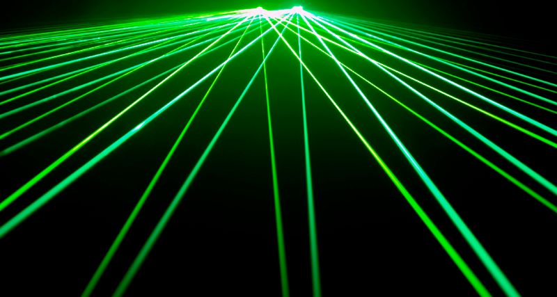
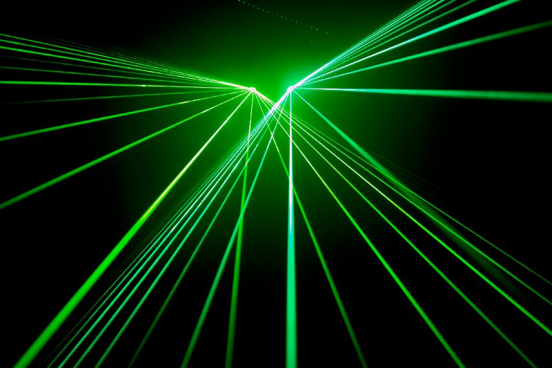
Here are some fan diffractions, 31mW 515nm on right 15mW 532nm on left:
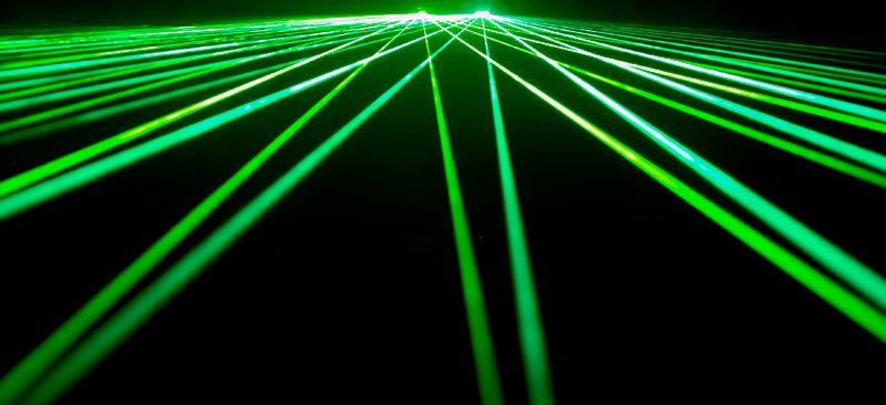
515532fan1_zpsteic1720.jpg


515532fan2_zpsyf77s4ni.jpg


515532fan3_zpse53gya84.jpg


Beam side by side 532nm left 515nm right:
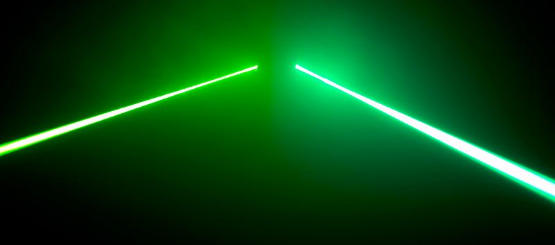
515532beam_zpszvudduxl.jpg


532nm and 515nm matrix diffracted together:
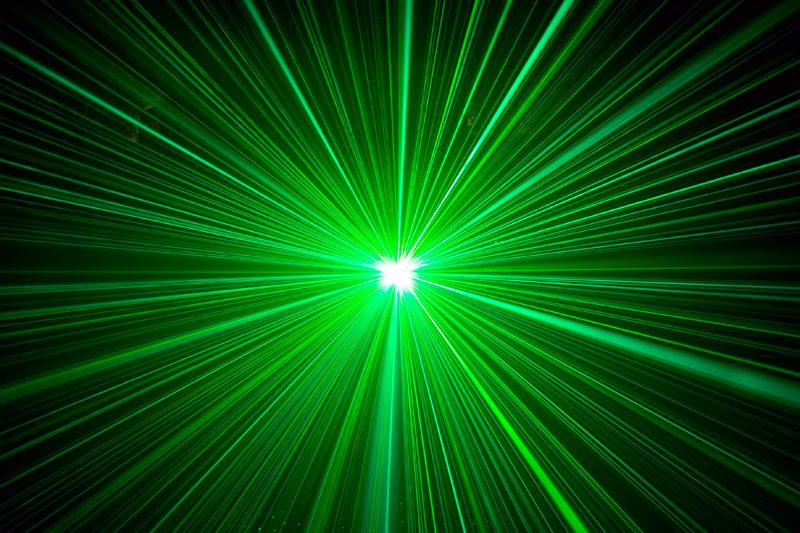
515532matrix_zpsvvcgecob.jpg


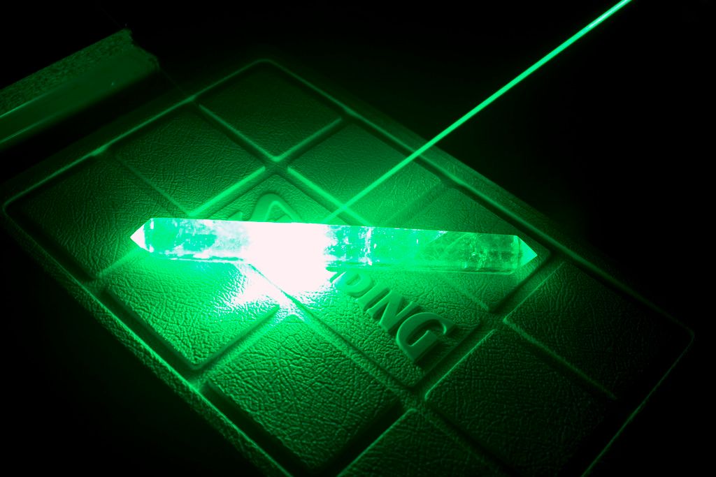
I found that lasing my quartz crystal yielded the best color comparison vs. beams and fog:

532nm lasing quartz:
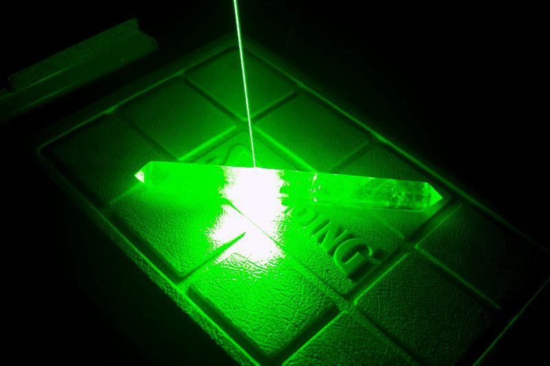
532quartz_zpsez3a3h6o.jpg


515nm lasing quartz:

515quartz_zpsgxcoffmt.jpg


532nm lasing quartz on dark background:
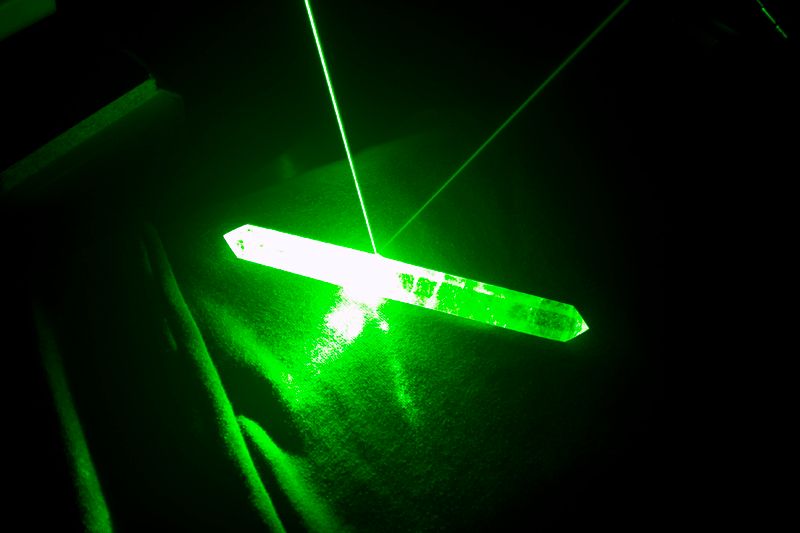
532quartzdark_zpsrquy5lwg.jpg


515nm lasing quartz on dark background:
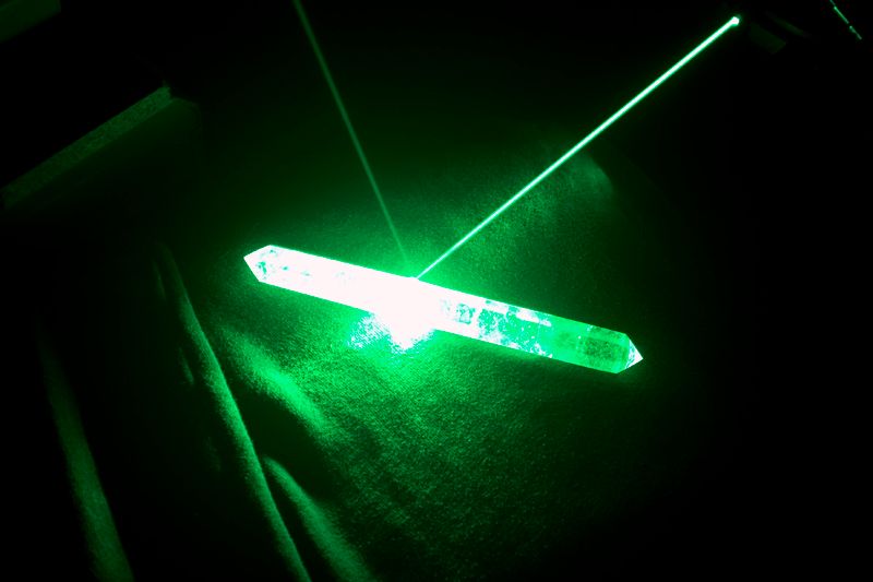
515quartzdark_zpsdroxnbwl.jpg


Finally, just for fun 532nm and 515nm lasing quartz on dark background:
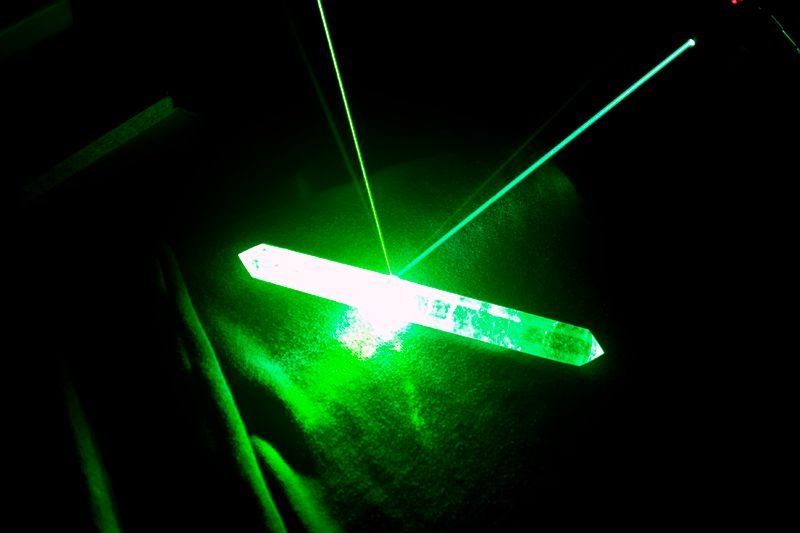
515532quartzdark_zpslf9kozf4.jpg


Well, hope you all enjoy and happy lasing! :beer:


Very nice. The crystal picture shows the color difference well.
 
All that beautiful green, and you just missed St. Patricks Day! :D
Very nice photos Lux! That very last pic really shows the wavelength difference well.
:kewlpics:
 
Thanks guys! This was actually more difficult than I thought it would be, since these photos were to compare the wavelengths versus just photos for photos sake. I do my editing of the camera raw images on my laptop and post them from there. Now after I viewed my thread from my galaxy s7 edge with its super bright screen my photos look different than what they look like on my laptop screen. So, what looks perfect to me on my laptop now doesn't show what I was expecting on my phone. The crystal shots look the best on both devices but the beam shots colors vary between my devices. I have never tried to do a comparison of wavelengths that aren't too far apart before so I will have to experiment more with that in the future. :beer:
 
I've got a really crappy camera. it's LCD display cant correctly display some wavelengths like 405nm, or the difference in blues. so I cant tell if I got a good pic till I look on my computer.

yours came out well. thanks for sharing
 
Awesome pictures! I didn't see the camera you use listed and was interested to know as it was able to catch the difference in color very well.
 
Awesome pictures! I didn't see the camera you use listed and was interested to know as it was able to catch the difference in color very well.

Thank you and thanks to everyone else! My camera is a Canon EOS 30D and for this set of pictures I was using my EF 28-200mm 1:3.5-5.6 ultrasonic motor Canon Zoom Lens. :beer:
 
Thanks guys! This was actually more difficult than I thought it would be, since these photos were to compare the wavelengths versus just photos for photos sake. I do my editing of the camera raw images on my laptop and post them from there. Now after I viewed my thread from my galaxy s7 edge with its super bright screen my photos look different than what they look like on my laptop screen. :beer:

Lux, absolutely beautiful imagery as usual my friend.
Just on the photos issue.
If you use RAW and edit in Photoshop, I find it best to have my colour space settings all the same, set to sRGB since most browsers render images to this colour space.

So my RAW colour space settings on my DSLR are set to sRGB and so to is my Photoshop settings.
This way you have a consistent colour flow in your workspace and the browsers will render the image in sRGB too.

Anyway just thought I'd share my workflow with you.

RB

Thanks! Also thanks for sharing tips, always feel free to pass on anything like that you have. I have all that already set as well though, and setup for web viewing. My issue is that my display on my galaxy s7 edge is so bright that my photos look different on it. All my other devices my photos look just about the same from display to display but my galaxy s7 is an outlier as it seems to not represent the colors the same way. I think it is over exaggerating everything to make the display really pop and have people say "Wow, look how bright and colorful that display is!" Where in reality it is not reproducing colors as accurately as it could if it weren't so hyped up. :beer:
 
Nice pictures Lux!

Amazing how much greener 515nm looks when compared to 532nm :)

-Alex

Thanks Alex! Yes, I really like the color compared to 532. I am very happy with the laser and it is on spec too. :beer:

I'm starting to prefer the cyan green look of these <520nm more and more.

I am glad I got this one, I really do like the color. :beer:
 
Last edited:
You did a great job with those pics. +REP
When I look at them with my phone the 532nm doesn't look like the green I expect to see but it's always hard when there's another color in the mix as a lot of times both will look not quite right next to each other. You can see the yellow in the 532nm and the blue tint in the 515nm though. You can also see how the color changes the closer the beams are. Background colors can play a huge part in all of it too. I like the color difference with the crystal individual pics that says Spalding even though the others may look more interesting with all the beams.


Back
Top