Welcome to Laser Pointer Forums - discuss green laser pointers, blue laser pointers, and all types of lasers

LPF Donation via Stripe | LPF Donation - Other Methods

Links below open in new window

ArcticMyst Security by Avery

LPF Banner

Joined
Jan 12, 2008
Messages
3,290
Points
83
Am I the only one here that is annoyed by it?
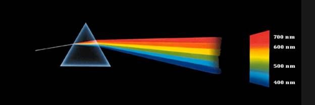
How the prism refracts the light in the wrong direction, and also refract the beams by the same amount, despite their different wavelengths?
I find it very distracting and unprofessional looking.


Edit: I don't have any ill meaning toward whoever made it. I think it can be a great banner, if it is done right.
 
Last edited:


Joined
Feb 21, 2013
Messages
5,013
Points
0
well do what some great man once said "if you dont like it, fix it. if you dont want to fix it then dont say anything"

no disrespect with that saying, been wanting to say it for a while and this is the first place that i found fit :D
 
Joined
Apr 19, 2013
Messages
2,246
Points
63
:pop:

It was made by Stin. What would the proper refraction angle be?

~ LB
 
Joined
Mar 11, 2013
Messages
1,541
Points
83
hmmm. good point, had not considered that. the light going in should be white too. It'd be cool to have all the colors too, not just three
 
Joined
Jun 20, 2013
Messages
530
Points
0
look up pink floyd dark side of the moon. there should be some pics of of light diffraction through a prism
 

Stin

0
Joined
Sep 29, 2009
Messages
132
Points
0
Hey guys! When I made this design I had that the colors were different colored lasers going through the the prism from right to left. I am not entirely sure how exactly the laser would go through at the specific angle (but it probably isn't that), and also the material of the prism matters as well.

I gave Avery this option to for the banner too.

BxwZomc.png


If you would like to get some ideas together and all agree upon it I would be happy to change it.

Edit: I only have 30 pixels in height to work with which is why I only did 3 beams, It gets cluttered if there are more. Colors are free to change too. I chose purple and red as the ends because, well they are the ends and green is about in the middle. I've tried a few color combinations, but I liked this one the most because the colors don't blend as much
 
Last edited:

Stin

0
Joined
Sep 29, 2009
Messages
132
Points
0

That's white light going through and equilateral at an upward angle.

The prism in the logo does appear to be about the same as an equilateral (didn't intend on that) but the stripes are different colored laser beams coming in from the right parallel to the surface. I don't know how exactly that would bend through that prism. And if you want to get real technical they are hitting different parts of the prism, not the same spot.

That's my thought process.

I do not have enough knowledge of physics to create this image, nor do I own a prism. So I went with the best visual design.
 
Joined
Jan 12, 2008
Messages
3,290
Points
83
well do what some great man once said "if you dont like it, fix it. if you dont want to fix it then dont say anything"

no disrespect with that saying, been wanting to say it for a while and this is the first place that i found fit :D
I had a feeling one would say that, but it needed to be criticised. This is the front face of LPF; it should be taken a bit seriously so this place don't look silly or ignorant about our own hobby.

Hey guys! When I made this design I had that the colors were different colored lasers going through the the prism from right to left. I am not entirely sure how exactly the laser would go through at the specific angle (but it probably isn't that), and also the material of the prism matters as well.

I gave Avery this option to for the banner too.

BxwZomc.png


If you would like to get some ideas together and all agree upon it I would be happy to change it.

Edit: I only have 30 pixels in height to work with which is why I only did 3 beams, It gets cluttered if there are more. Colors are free to change too. I chose purple and red as the ends because, well they are the ends and green is about in the middle. I've tried a few color combinations, but I liked this one the most because the colors don't blend as much

This is much, much better. I would be happy if Avery use this :)
 
Last edited:
Joined
Sep 20, 2008
Messages
17,622
Points
113
I had a feeling one would say that, but it needed to be criticised. This is the front face of LPF; it should be taken a bit seriously so this place don't look silly or ignorant about our own hobby.

I agree... we don't need to give the LPF Haters another bullet
to shoot in this direction.

It would also make more sense to use a White Light line (like
HitShane showed) going into the Prism or you would need to
change the Prism for a FS mirror which would no longer be an "A".

You could still keep the Colored beams parallel. It's called artistic
license but would be much more accurate....IMO


Jerry
 
Last edited:
Joined
Nov 10, 2008
Messages
4,186
Points
63
I had a feeling one would say that, but it needed to be criticised. This is the front face of LPF; it should be taken a bit seriously so this place don't look silly or ignorant about our own hobby.


This is much, much better. I would be happy if Avery use this :)

I couldn't agree more. +1
 
Joined
Jan 12, 2008
Messages
3,290
Points
83
I agree... we don't need to give the LPF Haters another bullet
to shoot in this direction.

It would also make more sense to use a White Light line (like
HitShane showed) going into the Prism or you would need to
change the Prism for a FS mirror which would no longer be an "A".

You could still keep the Colored beams parallel. It's called artistic
license but would be much more accurate....IMO


Jerry
IMO it can stay with the parallel beams. It is still correct. Though, an incoming white beam is more traditional, but I think that the red, green and violet beams is a good tribute the 3 most common colours that we had before the 445nm era. And the parallel beams can be interpreted as separate pointers.
 

Stin

0
Joined
Sep 29, 2009
Messages
132
Points
0
The prism actually isn't a prism at all. It is a series of mirrors that when placed in a 2D image appear as a triangle, which resembles a prism. /Joking haha

Though, an incoming white beam is more traditional, but I think that the red, green and violet beams is a good tribute the 3 most common colours that we had before the 445nm era. And the parallel beams can be interpreted as separate pointers.

That's another reason why I chose those 3 colors.

I know that the white beam is more traditional, but to be honest that iconic and cliche image is associated a lot (and maybe more) with pink floyd, and I would like to stay away from it, if possible. Another reason is because it is light (and not specifically lasers) going through the prism, and this forum is primarily about lasers. Having collinear lasers go through a prism was what I though about when I was designing it.

But that is only my opinion, you guys are free to override me. Once we get a set idea I can re-design it if necessary.

Or if you like the other one I posted, we can go with that (in post #7).
Like I said in the original thread about this banner, you're free to share your comments/concerns with me.
 
Joined
Jan 12, 2008
Messages
3,290
Points
83
The pic in #7 is good and I think it should replace the current banner, top and bottom of the page.


Top