rhd
0
- Joined
- Dec 7, 2010
- Messages
- 8,475
- Points
- 0
I've kicked around in Chroma off and on, but I've never scrutinized its output, or had to rely on it's figures. In fact, I've generally booted it up only when someone has cited its figures relative to those produced by my own brightness comparison tool.
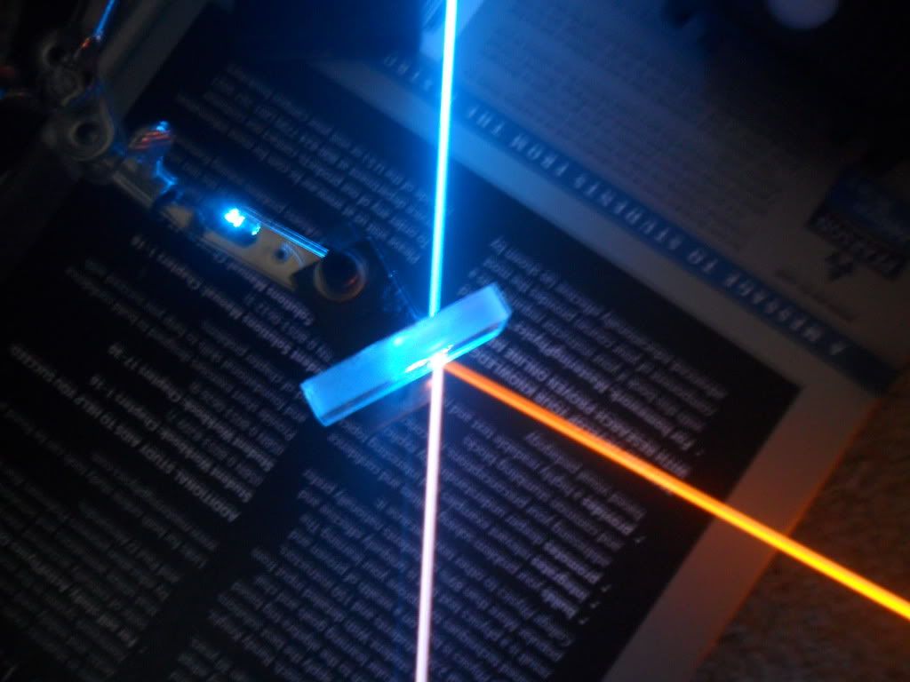
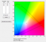
But this evening, I actually had occasion to need it's output figures for the balancing of a 445, 532, and 640. I know that Chroma is relied on by many, but speaking from my very limited colour mixing experience alone, Chroma is WAY OFF. See screenshot:

In what universe does 150 mW of 445 balance out 180 mW of 532? It doesn't matter if you're talking about the beam (considering Raleigh) or the dot (not), 180 mW of 532 is substantially brighter than 150 mW of 445.
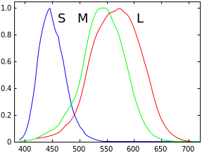
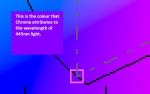
Second, look where Chroma is sticking 445 on the spectrum. I'm willing to accept that we all see colour differently, that there is no standard monitor calibration, and that not every diode we call a 445 is actually lasing at 445, etc etc etc. But this is too far from the reality of a 445's colour to attribute to perception, display, or diode variance issues. That's plainly too far into the violet.

But this evening, I actually had occasion to need it's output figures for the balancing of a 445, 532, and 640. I know that Chroma is relied on by many, but speaking from my very limited colour mixing experience alone, Chroma is WAY OFF. See screenshot:
In what universe does 150 mW of 445 balance out 180 mW of 532? It doesn't matter if you're talking about the beam (considering Raleigh) or the dot (not), 180 mW of 532 is substantially brighter than 150 mW of 445.
Second, look where Chroma is sticking 445 on the spectrum. I'm willing to accept that we all see colour differently, that there is no standard monitor calibration, and that not every diode we call a 445 is actually lasing at 445, etc etc etc. But this is too far from the reality of a 445's colour to attribute to perception, display, or diode variance issues. That's plainly too far into the violet.
Attachments
Last edited: