

From my understanding of nonlinear optics, laser crystals are only effective at certain wavelengths, but they become more efficient as the input power is increased. This may explain the existence of "freak" units with absurdly high powers.
This got me thinking: it would be cool if there were graphs that showed the efficiency of a laser crystal as a function of input power and wavelength. Because there are three variables involved, such a plot would have to be in 3D unless color gradients were used.
It would be impossible to get a perfectly accurate data set because every DPSS laser crystal is different, but I think even a rough illustration would be very useful to our members that want to learn more. Such a graph could be created for the most common crystals. Anyone up for the task?
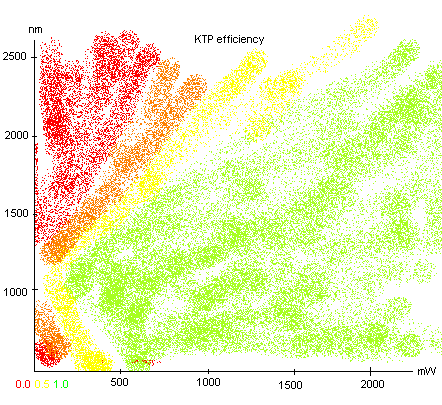
Edit: below is an extremely rough idea of what such a graph could look like:
This got me thinking: it would be cool if there were graphs that showed the efficiency of a laser crystal as a function of input power and wavelength. Because there are three variables involved, such a plot would have to be in 3D unless color gradients were used.
It would be impossible to get a perfectly accurate data set because every DPSS laser crystal is different, but I think even a rough illustration would be very useful to our members that want to learn more. Such a graph could be created for the most common crystals. Anyone up for the task?
Edit: below is an extremely rough idea of what such a graph could look like:
Last edited:


")
