Welcome to Laser Pointer Forums - discuss green laser pointers, blue laser pointers, and all types of lasers

LPF Donation via Stripe | LPF Donation - Other Methods

Links below open in new window

ArcticMyst Security by Avery

What is the wavelength of pure yellow?

What is the wavelength of pure yellow?

  • 565 nm

    Votes: 1 3.7%
  • 570 nm

    Votes: 2 7.4%
  • 575 nm

    Votes: 3 11.1%
  • 580 nm

    Votes: 8 29.6%
  • 585 nm

    Votes: 7 25.9%
  • 590 nm

    Votes: 5 18.5%
  • 595 nm

    Votes: 1 3.7%

  • Total voters
    27
Joined
Jul 20, 2013
Messages
321
Points
18
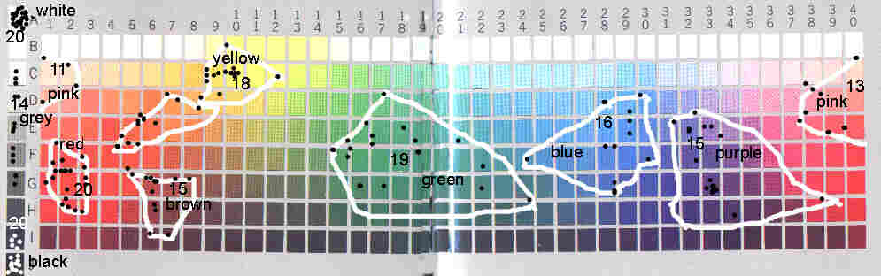
After that, it appears that, due to the way we perceive color, there will simply be a range of wavelengths that people will perceive as "yellow", as we don't all perceive it exactly the same due to genetic and other factors that produce our interpretations.

There may BE no exact "True Yellow in nm" for humans...it may simply always be a range, which is what the data supports thus far.

Exactly! That's what I was trying to say but I didn't because of my poor English!!!:crackup: +rep from me.;)
 
Last edited:


Joined
Jun 22, 2011
Messages
2,431
Points
83

Read the book up to the part where they start to describe all the languages involved.

While it is interesting I don't think I agree with their methodology.

First because they asked the participants to name all their colors *before* showing the table. Of course this limits the answers.

They define a completely arbitrary set of rules to determine whether a term is "basic" and use those rules to eliminate a lot of words which are, IMHO, legitimate names for colors. TBH they don't even follow their own rules, as they exclude from other languages the "descriptive terms" - which should have excluded orange. They also exclude cyan even though later on they admit Russian has two different terms for light-blue and dark-blue.

This seems to be the color table they used:
munsell2.JPG

grid.jpg

I think it's kinda muddy around cyan and magenta. The use of an HSV "color picker" would most likely trigger a different response.
 
Last edited:
Joined
Dec 10, 2013
Messages
1,343
Points
83
Do people here see 589nm as yellow? I have never seen a 589 laser but I have seen 593.5, I have also seen plenty of low pressure sodium street lights, which emit monochromatic light around 589nm. They look positively orange to me, no argument.

It is worth noting however that in different times of day they can look quite different. During the day street lamps (if they've come on for whatever reason) do look more "yellow" and my Rigel laser certainly looks yellower. At night, and particularly during twilight however the street lamps look very orange, trending almost towards red. I understand this to be due to the fact that the ambient colour temperature drops when it darkens, especially at dusk where everything just becomes a blue grey colour.

This obviously affects how we perceive colours, and the effect of how they can vary is to use a camera with a hard set white balance. The image colour cast will vary hugely, it will wash out yellow under sodium lighting or turn cold under flash.

Still, it'd be a push for me to say I see 589nm as proper "yellow" in almost any condition. Possibly because "yellow" to me ends at something roughly lemon coloured. I've had "arguments" about this before, where I've insisted the wallpaper was orange and apparently it wasn't. Yellow to me just isn't anything like some people call it. Any slightly hint of red, anything less than "lemon" yellow, and it ain't yellow. IMO.
 
Last edited:
Joined
Jun 22, 2011
Messages
2,431
Points
83
Never seen 589nm on a laser, but I have seen 585-590nm LEDs and they're definitely amber/golden, but might still be classified as yellow. 605-610nm LEDs are unarguably orange.

To me the best yellow there is 9B, but it's a bit too whiteish.
 
Joined
Dec 10, 2013
Messages
1,343
Points
83
Never seen 589nm on a laser, but I have seen 585-590nm LEDs and they're definitely amber/golden, but might still be classified as yellow. 605-610nm LEDs are unarguably orange.

To me the best yellow there is 9B, but it's a bit too whiteish.

I don't know where you are in the world, but if you're somewhere that sees a lot of low pressure sodium street lights, that's 589nm. To me they look orange, almost like the colour of a tangerine with some lemon mixed in.

I don't think LEDs are monochromatic either, so while the ones you saw might have had a principle wavelength of 585-590, there would most likely have been others mixed in. You can only really judge the colour via monochromatic sources, and for 589 I only know of two sources - low pressure sodium bulbs and a laser.
 
Joined
Jun 22, 2011
Messages
2,431
Points
83
Ours are high pressure, they do have the D line but it's less pronounced.

I know LEDs aren't monochromatic, but they do make OK approximations to laser colors. I have some green LEDs sold as 520-530nm that are very similar to my 520nm laser (far more similar than a 532nm or a picture on a computer screen).
 
Last edited:
Joined
Dec 11, 2011
Messages
4,364
Points
83
I have a 589nm LPS sodium lamp and it looks to be closest to 9E to me in most lighting levels. To my very dark adapted eyes it looks to be almost 7F though.
 
Joined
May 6, 2013
Messages
178
Points
0
Read the book up to the part where they start to describe all the languages involved.

While it is interesting I don't think I agree with their methodology.

First because they asked the participants to name all their colors *before* showing the table. Of course this limits the answers.

They define a completely arbitrary set of rules to determine whether a term is "basic" and use those rules to eliminate a lot of words which are, IMHO, legitimate names for colors. TBH they don't even follow their own rules, as they exclude from other languages the "descriptive terms" - which should have excluded orange. They also exclude cyan even though later on they admit Russian has two different terms for light-blue and dark-blue.

This seems to be the color table they used:
munsell2.JPG

grid.jpg

I think it's kinda muddy around cyan and magenta. The use of an HSV "color picker" would most likely trigger a different response.

I have never actually studied "color nomenclature theory" (as it is called) although I've run into it in passing. For example, just reading the kind of books they advertize in Scientific American, on linguistics, anthropology, evolutionary psychology, etc.. Even though I have studied many different aspects of light, color and vision, this just hasn't been one of them. The only reason I brought it up is because people were implying that color names are arbitrary, and I remembered having read something to the effect that they were not.

I have also read enough about evolutionary psychology in general to have an opinion about how plausible such a thing is. When AI researchers design a robot that can navigate a room, pick up some wooden blocks, then pile them on top of each other in a certain order, the programming behind that is really complicated. Mathematically it involves "intractable problems." One way to solve intractable problems is to have default values for unknown variables, then try solving it, then go back and make corrections as needed. It turns out that the human brain has a whole bunch of default assumptions built in. Optical illusions are good examples of what happens when those assumptions fail. In other words, the assumptions hard-wired into our brains don't always work, and can be overridden by learning and experience.

The original work on this was a book by Berlin and Kay published in 1969. It wasn't available on Google Books in preview mode, so I linked to another book that summarized their work.

In 1970, the World Color Survey was started at UC Berkeley, based on the work of Berlin and Kay. They have research projects going on at many different universities. So far they've got data from 110 unwritten languages (not to mention plenty of written languages).

The World Color Survey
Linguistic relativity and the color naming debate - Wikipedia, the free encyclopedia

As for the idea that these rules are arbitrary, there have actually been some changes. For example, instead of asking people for a list of basic color names, they now just show them the color chips one at a time and ask, "What color is this?" I'm not sure if this takes care of the problem of orange.

What you said about Russian doesn't make sense. They are surveying dozens of cultures and looking for patterns. This is a signal-to-noise issue. A single instance does not constitute a pattern.

As for using an HSV color picker, we're talking about a field of research that spans decades. My earlier work in graphic design is stored on 8-inch floppy disks. (This was before they came out with the new 5 1/4-inch "mini floppies" or the even newer 3.5-inch "micro floppies.) Scientific research has to be reproducible.

I think what it all comes down to is that you either believe in evolutionary psychology or you don't. Some people just have a visceral reaction against it.


And now a progress report on my wavelength to hex conversion tool.

9621-snapshot-project-today-has-serious-problems-do-not-use-reference-guaranteed-incorrect.png


I have two that I've been looking at, one from an LPF member, another called Spectra that I downloaded from Wolfram Alpha. They seem to be identical in terms of input v. output. However, they require a monitor that I don't have, so I'm working on one that would work for sRGB. The wavelengths and hex values of the primaries and secondaries look like this:

nm sRGB
650 611 #FF0000 red
510 549 #00FF00 green
440 464 #0000FF blue

580 580 #FFFF00 yellow
490 490 #00FFFF cyan

The first set of wavelength numbers are the ones built in to the two hex converters I mentioned. The second set of what I have on my computer: sRGB.

I know sRGB has a very limited gamut, but that's what most people have in cheap laptops and cheap digital cameras, so such a tool would be useful for Joe Average.

There's a trick for simulating a deeper hue of red: reduce the intensity of the red dots, and add a little blue. For violet you go down on the blue and add a small amount of red.

My own approach to trying to make this work is to hand craft it using certain wavelengths as landmarks. Assuming you're first modeling this on a vector graphics program like Inkscape, you create a long narrow rectangle with tick marks and wavelength numbers, then use the gradient tool to put in a bunch of nodes: two at the ends, plus 3 for the primaries, 2 for the secondaries. Then you create additional nodes for tertiary colors, and eventually quaternary and quinary colors. (In some places you need to add a few ***tary colors.) All the nodes (except for out-of-gamut colors) are equal spaced in terms of their hex values.

Then you get a list of items of known (or semi-known) wavelengths. For example, green and amber traffic lights (500-507 and 590-594.5). Also "Don't Walk" signs (610). Common laser colors: 405, 447, 473, etc. Then just adjust the nodes so that nothing looks terribly out of place. In other words, you don't aim for perfection but just nothing obviously standing out as wrong. Then alpha test it on your friends. Since nobody sees color exactly the same way, the goal should be to just get something that looks decent to most people.

Finally, here's a little experiment: if you have graphics software on your computer, make a yellow square. The hex values should be pure RGB yellow: ffff00. Question: does it look yellow? How many people do you know who see it as yellow?
 
Last edited:
Joined
Mar 10, 2013
Messages
2,918
Points
113
561 - chartreuse bannana yellow-green
568 - about the same as above, but more yellowish.
577/578 - lemon yellow
589 - golden yellow (has an orange tint)
593.5/594.1 - amber yellow/yellow orange (a bit more orange still, some people may even see it as orange. especially in the dark)
604 - orange, with a hint of yellow.
607 - orange
611.9 - red orange
632.9 - pinkish red with some orange in it

I've ran these wavelengths by eye in the downtown lab, and this is what is commonly agreed upon.
 
Last edited:
Joined
Jun 22, 2011
Messages
2,431
Points
83
The comment about Russian was just an example, which I mentioned because it coincides with what I said earlier. That book lists a lot of counter examples to their study. Not to mention most of the people they interviewed spoke two languages, which surely impacts things (my native language has no word for amber and now everytime I see that color I think "amber").

I also wasn't suggesting an HSV color picker, I just meant whatever "tool" they used to show colors (and even the ordering of the colors) would affect the results.

I'm not completely averse to there being some sort of hardwired color-group-naming, but I'm skeptic about the way they got to that conclusion :p


But lets get back to what matters - the RGB converter tool!

TBH I think what corresponds best to my monitor is something inbetween the converter tool and the sRGB WL you listed. The 610nm seems particularly absurd, as that would look positively orange. If I had to guess I'd say 460nm, 540nm and 630nm. As for yellow and cyan I agree with your values. I also agree a slight darkening and blueing helps with deeper reds (I did that on my signature, but aiming at differentiating colors and not at being realistic).

0xffff00 looks perfectly yellow to me, but that might be because I'm so used to it I "defined" it as my standard yellow.

I have a very hard time believing the red on my monitor is 611nm. That'd be way more orange. It looks more like 630 or something.


Edit: Spectra and the RGB converter don't have identical outputs. Try 589nm on both. Violet also looks a lot better on RHD's. And I think they peak red at 645nm.
 
Last edited:
Joined
May 6, 2013
Messages
178
Points
0
The comment about Russian was just an example, which I mentioned because it coincides with what I said earlier. That book lists a lot of counter examples to their study. Not to mention most of the people they interviewed spoke two languages, which surely impacts things (my native language has no word for amber and now everytime I see that color I think "amber").

I also wasn't suggesting an HSV color picker, I just meant whatever "tool" they used to show colors (and even the ordering of the colors) would affect the results.

I'm not completely averse to there being some sort of hardwired color-group-naming, but I'm skeptic about the way they got to that conclusion :p


But lets get back to what matters - the RGB converter tool!

TBH I think what corresponds best to my monitor is something inbetween the converter tool and the sRGB WL you listed. The 610nm seems particularly absurd, as that would look positively orange. If I had to guess I'd say 460nm, 540nm and 630nm. As for yellow and cyan I agree with your values. I also agree a slight darkening and blueing helps with deeper reds (I did that on my signature, but aiming at differentiating colors and not at being realistic).

0xffff00 looks perfectly yellow to me, but that might be because I'm so used to it I "defined" it as my standard yellow.

I have a very hard time believing the red on my monitor is 611nm. That'd be way more orange. It looks more like 630 or something.


Edit: Spectra and the RGB converter don't have identical outputs. Try 589nm on both. Violet also looks a lot better on RHD's. And I think they peak red at 645nm.

Regarding previous posts, the English word "orange" certainly violates their own rule, as the examples given are gold and silver (on what to avoid in doubtful cases). However, none of the languages surveyed were English, so I don't think that's a valid criticism.

Next, lots of researchers have looked at Berlin and Kay's work. There is a whole body of published literature examining the methods used. The World Color Survey has gone beyond the work of 1969. However, the Munsell color chips make sense when you consider the issue of continuity. For example, the famous MMPI test (525 questions) used in psychology was developed in the 1930s. Some of the questions have words that people today can barely understand, such as referring to women as "broads" and "dames" or alcoholic beverages as "hooch." (Or something like that.)

Next, on the LED issue. The advertized wavelength of an LED is just the intent of the manufacturer. If you want to know the real wavelength, it needs to be binned. They test them with a digital spectrometer, then put all the ones that fall within a certain wavelength range in bin number 1, the next wavelength range in bin number 2, and so forth. Except the bins actually have 5-digit serial numbers. I think traffic-light diodes are binned.

Then there's the dominant wavelength v. peak wavelength. The latest generation of Don't Walk signs have peak wavelengths of 620, but dominant wavelengths of 610. To figure out the dominant wavelength, get a spectrometer reading, then divide it into 1 nm slices. Adjust each slice for CIE 1931 (which is how they do it) or CIE 1978 (which is how I would do it). The resulting curve will have a lower peak. However, what we really need is the center of gravity of this new curve, since it will no longer be symmetrical. Divide this new curve into an odd number of equal-area slices (in terms of area under the curve) then pick the middle slice, even if it's not the highest one.

Sometimes they tell you what the dominant wavelength is.

As for 611 sounding unbelievable, I too am having a hard time wrapping my brain around that one. Maybe we need to go out and find some new-generation Don't Walk signs. Oh wait, is 611 the dominant wavelength or the peak wavelength? I'm confused.

This diagram uses CIE 1976, which is "dominant wavelength."

http://library.creativecow.net/arti...amColor_CRT_Replacement/DreamColor_gamuts.jpg

scroll down a bit: (no idea of what CIE version they used here)

EPSON Perfection 4870 PHOTO Scanner Review: There Is No Limit to Perfection!. Page 17 - X-bit labs


Top