Welcome to Laser Pointer Forums - discuss green laser pointers, blue laser pointers, and all types of lasers

LPF Donation via Stripe | LPF Donation - Other Methods

Links below open in new window

ArcticMyst Security by Avery

Kryton Logo competition

Joined
Jun 12, 2008
Messages
1,199
Points
48
;D

Yeah you are right though, just doesn't have the same pop in monochrome :-/

Back to the drawing board I guess.

brtaman
 

Attachments

  • Kryton4mc2.png
    Kryton4mc2.png
    95.5 KB · Views: 77


diachi

0
Joined
Feb 22, 2008
Messages
9,700
Points
113
Thats the best I can do atm, not too much point having a lot of detail or colour if its going to be gray scale anyway.
 

Attachments

  • KrytonLogo.jpg
    KrytonLogo.jpg
    62.1 KB · Views: 76
Joined
Mar 8, 2008
Messages
2,669
Points
48
ITS F*CKING LASERS 101 KEN!!!!!

oopsie.gif
 

lam3

0
Joined
Mar 30, 2008
Messages
58
Points
0
VillageIdiot said:
^I like it, actually. It looks like the Nintendo logo =D

I can also do the 'rather odd' style. Here's something, maybe 5 minutes in Flash MX with the grid on...? Needs some work, the N doesn't look right and stuff.
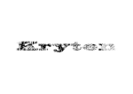
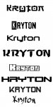
Thanks, your work is much better though.

Nintendo doesn't use an italic font though, hehe.

But, if the body of the host is silver, won't your colour kind of fade in with the background?

Ice crystals could work nicely on a black host I guess, or at least more than on silver. Even if it gets anodized well you'll still have trouble with discerning the small details.

Anyways, I have nearly no experience with Photoshop, this was actually the first time I used it to create something.
 

Amnizu

0
Joined
Jan 15, 2008
Messages
607
Points
0


I'm more of a fan of the oldschool 8-bit type than I am the ice crystals, but I'll do another one themed around the crystals soon.
 

Kenom

0
Joined
May 4, 2007
Messages
5,629
Points
63
Those are all some very good submissions guys. Keep up the good work.
 
Joined
Jul 24, 2007
Messages
2,749
Points
0
Too fiddly most likely but here is my first try.... I have to say that I like the look of some of the text only ones above.....

Regards rog8811
 

Attachments

  • kryton_large01_001.jpg
    kryton_large01_001.jpg
    46.2 KB · Views: 72
Joined
Jun 12, 2008
Messages
1,199
Points
48
Some more from me :) less complex, I didn't use your window ice, just made a basic ice text.


brtaman
 

Attachments

  • krytondark2.png
    krytondark2.png
    25.8 KB · Views: 79

Kenom

0
Joined
May 4, 2007
Messages
5,629
Points
63
brtaman said:
Some more from me :) less complex, I didn't use your window ice, just made a basic ice text.


brtaman

Now THAT is what I'm talkin bout.  Doesn't need to be really complex.  Nor does it have to have a LOT of detail.  Now imagine that with just a small crystaline look to it kinda like shadowgypsie's but not so detailed. (she's more workin on the larger website image first.

I have to say, I really do like some of those plain text submissions. I wasn't looking for just plain text but some of those are VERY creative.
 

Kenom

0
Joined
May 4, 2007
Messages
5,629
Points
63
here is something I kinda threw together to give you an idea maybe of what I'm seein.  it's really bad, but what can I say.  this is not where my skills lie.  Hence the reason you all are workin for it!!!  LOL  Those that can't hold contests.  mwahahahaha!

now of course there's only two letters and the cropping is horrible but the K an O are easy. The R will be hard!!
 

Attachments

  • untitled_028.JPG
    untitled_028.JPG
    9.1 KB · Views: 77
Joined
Jun 12, 2008
Messages
1,199
Points
48
Ask and you shall receive, made the black have some texture too.
 

Attachments

  • krytondark4.png
    krytondark4.png
    38 KB · Views: 74


Top