Welcome to Laser Pointer Forums - discuss green laser pointers, blue laser pointers, and all types of lasers

LPF Donation via Stripe | LPF Donation - Other Methods

Links below open in new window

ArcticMyst Security by Avery

JetLasers Power Meter Graph: Is This Acceptable?

Joined
Dec 3, 2014
Messages
57
Points
0
Hi folks!

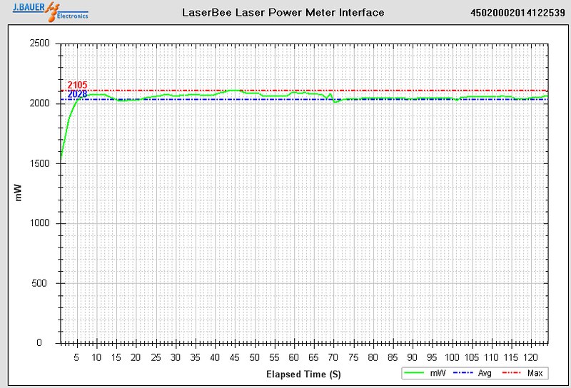
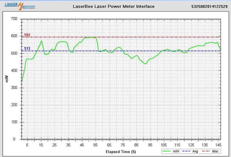
I finally got the power meter charts for my 2 new lasers from JetLasers and I am a little concerned. Should the lines be all over the place like this? The first chart is my 450nm laser and the second is my 532nm. I purchased these from JetLasers because everyone spoke highly of the quality. Is this acceptable?

The first chart doesn't seem as wild, but that's only an illusion because it is not as zoomed in as the second.

Let me know your thoughts please.


Joined
May 14, 2013
Messages
3,438
Points
0
Yes the first one looks normal. The second one is normal for 532nm DPSS lasers, it's common for them to be terribly unstable. Just in case you don't know, they can also be very temperature sensitive.

Alan
 
Joined
Mar 30, 2012
Messages
1,321
Points
0
They both zoomed in the same ratio. One is 120seconds and second is 145seconds. No big difference in zooming.

They are both looks okay to me. Though 405nm lasers are usually much more stable. But it is acceptable.

:beer:
 
Joined
Dec 3, 2014
Messages
57
Points
0
They both zoomed in the same ratio. One is 120seconds and second is 145seconds. No big difference in zooming.

They are both looks okay to me. Though 405nm lasers are usually much more stable. But it is acceptable.

:beer:

What I meant when I said zoomed was the chart for the 450nm laser shows a lot more range. The 532nm goes from 0-700mW where the 450nm chart goes from 0-2500. The measurement is around the same 100mW-ish range, but the numbers don't look as wavy because it is zoomed out because the chart goes up to a higher power rating.

You mentioned 405nm lasers are more stable. Mine is a 450nm. Were you commenting on the stability of mine or a 405? Should 450nm be more stable?
 
Joined
May 14, 2013
Messages
3,438
Points
0
The first laser is almost four times as powerful as the second one, it's not zoomed out and the fluctuation is within what would be expected.

Alan
 
Joined
Dec 3, 2014
Messages
57
Points
0
The first laser is almost four times as powerful as the second one, it's not zoomed out and the fluctuation is within what would be expected.

Alan

You are misunderstanding what I am saying. Or maybe I am not saying it clearly enough. Yes, it is zoomed out because the chart has more area to cover. If the chart for the 450nm laser only showed a range from 1700mW - 2400mW, then it would be zoomed to the same visual representation as the 532nm chart that goes from 0mw to 700mW. The 532nm graph shows breakdowns of 100mWs at a time and lines showing 20mW measurements between each 100mW measurement. The 450nm graph shows breakdowns of 500mWs at a time and lines showing 100mW measurements between each 500mW measurement. Therefore, it is zoomed out. The reason I brought this up is because looking at the range on the 450nm chart doesn't seem as all over the place as the 532nm chart because it is zoomed out to 500mW and 100mW increments. If it was zoomed in to show the green line in a graphed area of 100mW and 20mW increments, the line would show its fluctuation more clearly. Does that make sense now?

OMG did I just type all that? lol...


It doesn't really matter though. I am just glad that everything is normal. Thanks.
 
Joined
May 14, 2013
Messages
3,438
Points
0
No I didn't misunderstand, and your not making sense, the power fluctuation is small on the 450nm as a percentage of the power level compared to the 532nm, there is a huge difference between the two and a huge power difference.

Alan
 
Joined
Dec 6, 2013
Messages
1,236
Points
48
diode lasers are very stable but for the green its normal, if u want stable green buy 520 diode forest green hehe.
 
Joined
Dec 3, 2014
Messages
57
Points
0
No I didn't misunderstand, and your not making sense, the power fluctuation is small on the 450nm as a percentage of the power level compared to the 532nm, there is a huge difference between the two and a huge power difference.

Alan

Yes you did misunderstand and I am making perfect sense. I am not talking about the percentage of the power of the 450nm compared to the 532nm. I am talking about the range and detail level on the graph. If you zoom in you can see more detail in the line. If you zoom out you will see less detail. Its kinda the same reason why rulers have inches, half inches, mm, cm, and all those different measurements.

In the area that the 532nm chart uses to show a range of 200mW, the 450 chart is showing approximately a range of 1000mWs. It's a matter of zooming in to see more detail. If I zoomed in on the 450nm chart to where it showed more detail (a 200mW range instead of 1000mWs) I would be able to better see the fluctuation in the power.

If I went to Google Maps and wanted to see how many curves there were on route 30 taking it from point A to point B, and I was zoomed out to an overhead view that showed 500 square miles on my monitor, I would be able to see the street and its curves but not so accurately. If I zoomed in to a 25 square mile range on my monitor, I would be able to see much more detail in that route and I could measure it much more accurately.

I don't know how to make it any clearer.


Let's just let it be. Everyone answered my question and I know that my purchase is ok. Thanks folks! :beer:
 
Joined
May 14, 2013
Messages
3,438
Points
0
So for a laser 4 times as powerful you want a huge graph to show the same detail? You should be more concerned with how much the power fluctuates as a percentage of the total power, not in actual mW, 100mW isn't much to a 2000mW laser but is a huge amount to a 500mW laser.

Alan
 
Joined
Jan 29, 2014
Messages
12,031
Points
113
I think Pi R doesn't care whether the graph is zoomed out or not, he's looking at the numbers, not how it looks. My Jetlasers does exactly the sane thing but is normal.
 
Joined
Dec 3, 2014
Messages
57
Points
0
So for a laser 4 times as powerful you want a huge graph to show the same detail? You should be more concerned with how much the power fluctuates as a percentage of the total power, not in actual mW, 100mW isn't much to a 2000mW laser but is a huge amount to a 500mW laser.

Alan

I didn't want a huge graph. It doesn't take a huge graph to show what I was asking for. I was just curious as to the fluctuation it had. The graph could have started at 1700mWs and ended at 2400mWs and it would have been able to show things a lot more clearly without being huge. I understand what you are saying about being more concerned with the fluctuation as a percentage of the total power and agree with you 100%.

I'm not trying to argue. I was just trying to make clear what I was talking about. Thanks for your input!


Top